INFERNALLC
OVERVIEW
INFERNALLC is an asymmetrical multiplayer RTS game set within a corporate Hellscape. I was onboarded to revitalize this capstone-turned-passion project with a focus on overhauling the user interface for the Overseer character.
- Team Size: 17 Developers
- Development Time: 4 months
- Engine: Unreal Engine 5
- Released: October 2025
- Platform: Windows
Play for FREE on Steam!
UI/UX DESIGN - OVERSEER
InfernaLLC is the first project that I’ve been onboarded to without being part of the initial concept phase. With a pre-established framework, it was a new challenge for me to revamp the interface while retaining the core functionality. It became increasingly evident that one of the most critical pieces to my design approach was the aesthetic direction and how to incorporate it into my rework of the Overseer’s HUD.
The initial design for the Overseer HUD consisted of three elements:
- A timer that counted down and ended the match at 0
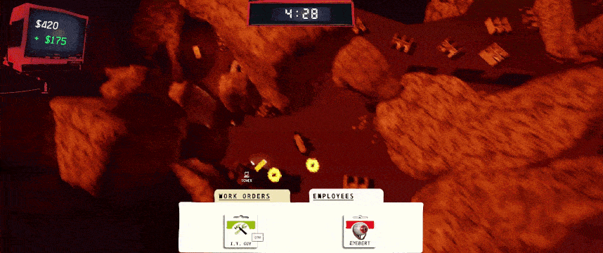
- A monitor to show how much capital the player lost or earned
- A hotbar with two tabs for deployable units and traps
The aesthetic direction leaned heavily into a grunge style with a corporate, paper-like feel. This gave the interface a “late 90s to early 2000s” tone, but I believed it could be reflected more strongly in the way the UI itself was structured. In addition, while the capital gained and lost was clearly conveyed to the player, the monitor element that displayed it tended to blend in with the background, causing a slight readability issue
My first redesign took a lot of inspiration from Windows 95. Not only did it drive home that antiquated corporate feel, but the windowed interface elements had borders, giving me an opportunity to use the red color palette while keeping things readable.
The deployment hotbar was now shifted to the top left, taking the appearance of folders instead of tabs. A popup window would open when one was selected, allowing players to drag and drop their traps or units from there.
The capital monitor was reworked to be a window containing a line graph. This was intended to show players whether or not the “investments” they had made generated some kind of return.
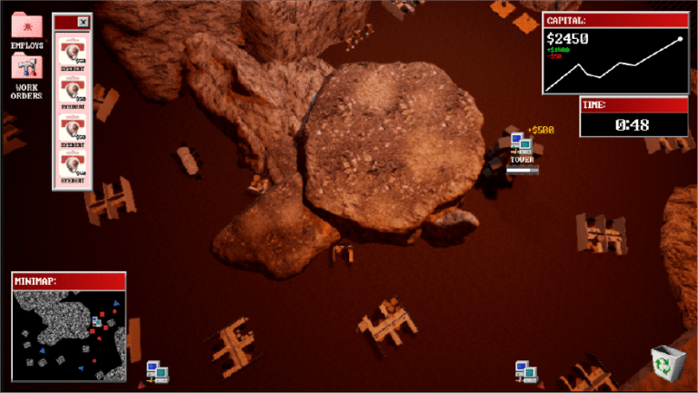
The timer was shifted from the top center of the screen to below the capital window, allowing players to read both elements more easily within a single area. During a design meeting, a new minimap element was suggested, and my initial visualization for it mirrored the Overseer’s perspective. I also proposed a “recycle bin” feature at the bottom right of the screen, allowing players to regain some of their capital by selling deployed units.

Once I began implementing the design, a couple of issues arose that needed to be addressed. The line graph, while an excellent idea, ultimately proved to be out of scope and would have required too much time dedicated to a single feature.
The recycle bin was also cut, as capital generation happened quickly and players would likely have little, if any, need for it. Removing these features allowed both myself and the team to focus on HUD elements the player would actually be interacting with— specifically, the hotbar.
When vertically organized, the hotbar popup window was too large and overlapped the minimap. To give the map more room to breathe I adjusted the hotbar popups to a horizontal layout and removed the background window panel, reducing clutter and screen density.
To further improve the user experience, I created animations and UI assets to provide player feedback, including highlights for the selected unit and visual indicators for unit cooldowns. Keyboard hotkeys were introduced as well, allowing players to select different folders and units more quickly than they could with the mouse.
The minimap was also expanded to show the entire level. Clicking a point on the map would snap the Overseer to that in-game location, allowing players to move around the map much faster than before and making it easier to defend towers. Tower health was also represented on the HUD at the top of the screen, giving the player the information needed to make more informed decisions about unit placement.

While this direction improved the UI from a usability standpoint, the Windows 95 inspiration created a more blocky and clean feel than we wanted stylistically. To address this, I collaborated with the art team to incorporate grungy, distorted assets for the folders, icons, and panels. This succeeded in making the interface less clean, but only at the cost of losing the antiquated feel.
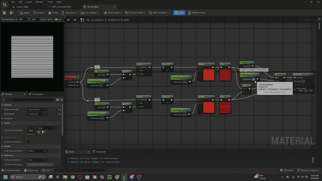
The final touch I added to the HUD was a CRT scan line effect. Tinting the texture red and reducing its alpha, the CRT effect worked incredibly well to sell that old-school tech feeling.
This material creates an animated scanline effect that moves across the screen, inspired by the visual interference seen on CRT displays.
The effect is generated using screen-space coordinates so the scanlines remain consistent across the viewport. The lines are animated using panning UVs, allowing them to smoothly move vertically over time.